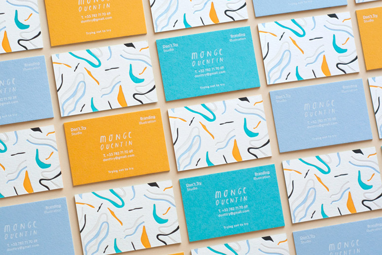
Although my wardrobe consists of every shade of black, my eyes seem to hover every time I see a burst of colour in a brand's identity. Here's some letterpress goodness from Don't Try Studio. "Though they are 5-color letterpressed, white-foiled, and triplexed, Designer Quentin Monge’s playful, self-promotional business cards still don’t appear to be trying too hard." — KELLY CREE Via Under . . .
Strike One
If only matchboxes always looked like this... The "Strike" Collection: Designers Clara von Zweigbergk and Shane Schneck teamed up with Danish design house HAY to transform one of the most mundane of items into something colourful and eye-catching. The striking area which is usually just functional, was turned into a part of the matchbox's design with a stroke of creativity. via . . .
Wobbly Type
Jelly is delicious to gobble, a treat enjoyed by both children and adults. Well, I'm assuming that most adults still like jelly - how can you think that the colourful, sweet, half-food half-liquid food is anything but great? Well now apparently you can also make typography with the rainbow treat. m-inspira, a pair of designers from Valencia in Spain, recently created gelatin letters as one of . . .
Bright Colours & Baby Hedgehogs
The illustrations I just stumbled across are seriously adorable. And when I say adorable - I mean the type that makes you all warm & fuzzy, even when it's freezing outside and you're in desperate need of a hot chocolate. Probably the same reaction as when you first saw a baby hedgehog (just to refresh your memory, have another look at it). Okay back to the illustrations. via Laura George . . .
Pencil Shavings
Here's some playful illustrations to throw little bits of mid-week happiness your . . .
