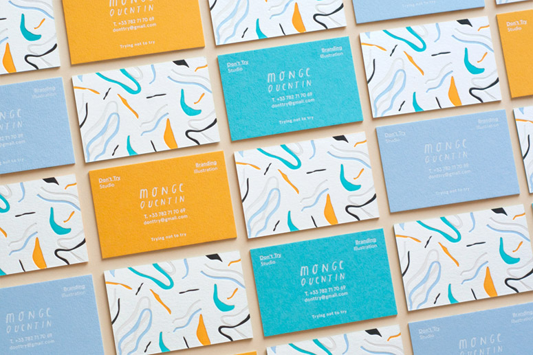
Although my wardrobe consists of every shade of black, my eyes seem to hover every time I see a burst of colour in a brand's identity. Here's some letterpress goodness from Don't Try Studio. "Though they are 5-color letterpressed, white-foiled, and triplexed, Designer Quentin Monge’s playful, self-promotional business cards still don’t appear to be trying too hard." — KELLY CREE Via Under . . .
Hip Hop Dudes
These little guys are so great. Created by graphic design studio FOREAL and inspired by hiphop culture, their hairstyles and styles are reminiscent of the rappers across a range of different eras. They bring back memories of the days when I was driving around in my yellow Celica with blonde streaks in my hair, blasting R&B and hiphop from burnt CDs. A time . . .
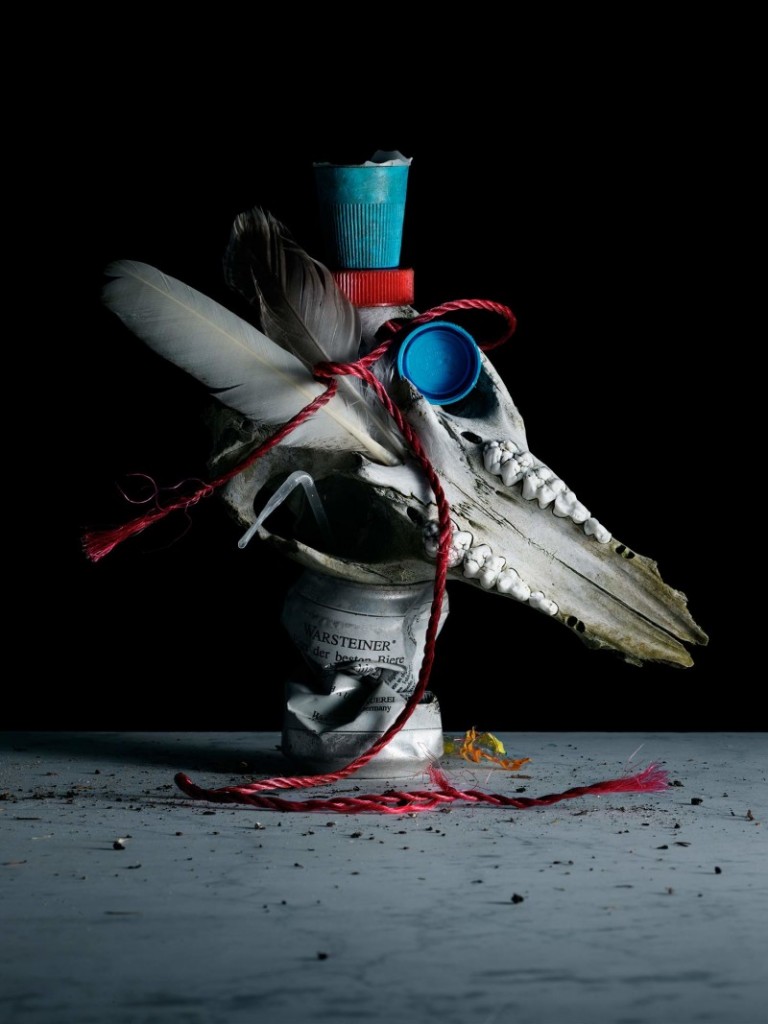
Trash, Debris & Rubbish
Philip Karlberg is a Swedish still life photographer who often finds his inspiration in nature. Karlberg collects trash whenever he can and attempts to clean up even the most remote of places. This sparked the inspiration for this new series titled “Debris”, where he stylistically put together his finds and shot these still lifes in his studio. "His photos are characterized by a pristine, . . .
Organised Chaos
A great picture of costume designer Isabel Toledo in her studio, photographed by Biel Parklee. via W Magazine . . .
Tilting World
Design studio ‘XYZ Integrated Architecture’ from Georgia seems to have quite the thing for tilted axes and acute angles. They take this across to their series of furniture, which have been designed to tilt as if they are just about to collapse on one side. I seem to find myself with my head a little to one side when looking at these images: These playful pieces explore the connection . . .


